So this is one of two patterns I'm testing for Cheryl at
Meadow Mist Designs. I love testing patterns. (cough) This is only my second. Ha! But I still love it. I think the English teacher in me loves the marking/grading aspect; the quilter LOVES the playing in my fabric stash (OMG I have to do this MORE; I am like Bella with a knitted scarf or afghan, rrrrrowwwwrrr, knead, knead, purr, purr, where have you been all my life? kind of warm and fuzzy feelings) okay.... totally lost my train of thought....phew! Shake! Okay!
So here are my fabrics. All these photos are under the Ott-Lite.
(Would you believe I bought these about 10 years ago with the idea of making a jacket with them? Kinda glad I never got to it.) I've made some great quilted jackets, all but one, however, which read as a solid. Had I sewn one with these fabrics, I can hear my brother saying, as he did about a beautiful, hand-knitted, hand-dyed, hand-woven wool heavy sweater I bought, and paid good money for, "How many couches did you kill for that sweater, Sa-sa?" Still loves to tease. And I digress. Again.
Then I started closely reading the pattern for Grande Scrappy Tiles. Um what was I thinking? I had six fabrics to start with, once I added in a light. I need 21!!
HALLELUJAH!! (how exciting--more fabrics!)
So I got my
Weeks Ringle on (just discovered she also writes an interesting weekly-haha-
blog), and tried to do a Stash Rx on my choices. Because I love sharing my thought (what I remember, lol) and design process, and I love reading others' thought and design processes, and because I have now
taken the process pledge (thank you Julie, for having that button on your blog, and curious, I had to check it out) here is how I arrived at the block you see below.
Disclaimer: I have a double-major in English and French degree, and do not profess to know all the colour rules, so there very well could be some grave errors here, but it's my party...
 |
| Adding in an interesting light. |
The light has flecks in it, which have made it more difficult to use as they seem to pop and annoy, rather than interest the viewer. Here, it works.
 |
| Adding in pinks, and score! I like this taupe light as it picks up the beiges in the floral |
I decided to aim for 4 pinks, blues, burgundies and greens in range from dark to light. That would make 19 fabrics all told with the 2 lights. I'd fill in 2 more maybe at the end.
 |
| 4 pinks done, found a raspberry/burgundy marble I'm liking with the flecks of purpley-blue in it |
Not sure on that white background though of the one pink. I remembered Weeks saying not to add in white if it isn't there, and the backgrounds here are cream. Also like the different character of the rose one with the "jacks" shapes on it.
 |
| Took it out. |
 |
| Now for the blues |
Weeks also says that prints that are similar, as in large scale, or quite intense bold ones, or, in this case, floral, can be combined. So I decided to add in some blue florals that have more than one colour and cream in them. Hmmm.
 |
| Trying for some larger range from light to dark; also for a variety in prints |
I remember Jinny Beyer saying to always put a bit of black in a quilt, and also that quilters often don't go dark enough or light enough. So, I'm trying to go darker than I think. The coral in the blue/coral floral is bothering me here, and the blue-green plaid just isn't doing it, the dark blue flecked one which I used for a binding on another quilt has white pops in it. Not sure on the top left dark tiny blue floral. It's on a black background and even though JB said always add some black, this one seems too different.
 |
| I removed these, thinking the turquoise was the wrong shade of blue, even though I liked the change in motif |
Still unsure as I look at the photos the next morning as I'm writing this up, about removing that black background blue floral! I also did remove the blue/green plaid, and the coral floral.
 |
| Blues decided upon |
 |
| Love finding that stripe! And another green floral, not sure on the pale green small floral |
I also was interested to see the tree bark green, which I bought for a backing of some future quilt, might work here too, and change the floral up a bit too. Not sure on the very pale green. It has soft pops of purpley-blue (is that periwinkle?) though which I'm liking. Also the modern (and newest fabric in the lot) green with beads(?) and lines on it--interesting, but I don't know... My head is starting to hurt! As are my eyes.
So I eliminated the small floral, thinking it was too cutesy and not in the olive or asparagus-colour range. I've kept the real light because I'm just realizing that I only have one real light! Only a few real darks. Uh oh, is this too ho-hum? Too medium-range only?
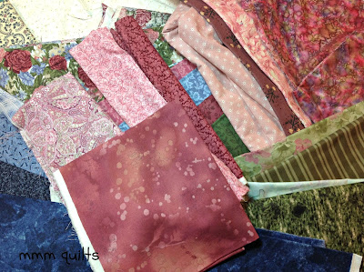 |
| Burgundies...which are reading awfully similar to the pinks I already did! |
There is some white in a couple of these, so I'm not sure. I really like the fossil fern one; the tone is perfect and the print is different. I also love the middle-of-the-photo roll of two-tone burgundy; when I found it, I just thought 'Yes!' and it's perfect. And I kept thinking I need a blue that is dark but richer, more in the deep royal colour. Found this marble, so I'm going to add it. I need 21; my formula of 4 of each colour plus main floral and light doesn't yield 21 total.
So I decided to arrange my 22 (I think by this time) fabrics from dark to light, ignoring the colours, and see what I had:
 |
| 22 here, mostly in the mediums, mostly floral or softer motifs |
I did three things: First, I looked at this under the Ott-Lite, then I shut off all the lights except for one small one, so I could view the run in semi-darkness, a great tip (see my tips and Aha! posts under the tab up top), and finally looked at the thumbnail of the photo (which creates distance, and you can often detect not-so-good pops or jumps). I came to these observations:
Lots of mediums, maybe too much.
Unsure of the paisley purpley-pink. (4th from the lights side) but I like that it's paisley.
The fossil fern (which I love!) reads the same as the marbled one with the purpley-blue poofs in it, as well as pretty similar to the one with the black "jacks" in it; one has to go.
I do need to keep that very pale green...I think. If it is still bugging me, maybe that's an indication it should go.
 |
| Final 21! What do you think? |
This took me about an hour and a half. It was so much fun, and such a rush (who needs drugs?!) to rifle through all my stash, petting and caressing, smoothing and admiring, finding treasures (man I have a LOT of blue fabric) and trying to get more of the fabric INTO quilts!!
So, next step is to make the blocks, which are 24.5" unfinished. Any thoughts or suggestions about my final 21 are much appreciated. I still love that fossil fern, still am thinking about that black background tiny blue floral in the 7th photo, still unsure of the purpley-pink paisley and the very pale green. Ya, are you seeing a trend here? Hate making decisions, second-guess myself...
Linking up with
Pink Doxies Pet Project Saturday.
Update:
Judy's suggestion in the comments:
When I look at this, especially without my glasses (I'm near-sighted, which can be a wonderful advantage when wanting to fuzz the fabrics together!) I see where I didn't have these arranged quite correctly, but I'd kind of figured that out, BUT I think this will work! I think there is a good range, and I don't think there are too many mediums. Thanks Judy!!
And, since I posted, I JUST found out that I can let the cat (finally) out of the bag:
I'm a Moda Bakeshop designer!! See my Pyramid Pouch
here! Now to get the button for my sidebar, and write about it for tomorrow! Eeeek!


