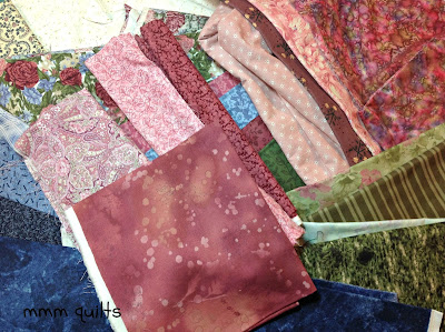
So here are my fabrics. All these photos are under the Ott-Lite. (Would you believe I bought these about 10 years ago with the idea of making a jacket with them? Kinda glad I never got to it.) I've made some great quilted jackets, all but one, however, which read as a solid. Had I sewn one with these fabrics, I can hear my brother saying, as he did about a beautiful, hand-knitted, hand-dyed, hand-woven wool heavy sweater I bought, and paid good money for, "How many couches did you kill for that sweater, Sa-sa?" Still loves to tease. And I digress. Again.
Then I started closely reading the pattern for Grande Scrappy Tiles. Um what was I thinking? I had six fabrics to start with, once I added in a light. I need 21!!
HALLELUJAH!! (how exciting--more fabrics!)
So I got my Weeks Ringle on (just discovered she also writes an interesting weekly-haha-blog), and tried to do a Stash Rx on my choices. Because I love sharing my thought (what I remember, lol) and design process, and I love reading others' thought and design processes, and because I have now taken the process pledge (thank you Julie, for having that button on your blog, and curious, I had to check it out) here is how I arrived at the block you see below.
Disclaimer: I have a double-major in English and French degree, and do not profess to know all the colour rules, so there very well could be some grave errors here, but it's my party...
 |
| Adding in an interesting light. |
 |
| Adding in pinks, and score! I like this taupe light as it picks up the beiges in the floral |
 |
| 4 pinks done, found a raspberry/burgundy marble I'm liking with the flecks of purpley-blue in it |
 |
| Took it out. |
 |
| Now for the blues |
 |
| Trying for some larger range from light to dark; also for a variety in prints |
 |
| I removed these, thinking the turquoise was the wrong shade of blue, even though I liked the change in motif |
 |
| Blues decided upon |
 |
| Love finding that stripe! And another green floral, not sure on the pale green small floral |
So I eliminated the small floral, thinking it was too cutesy and not in the olive or asparagus-colour range. I've kept the real light because I'm just realizing that I only have one real light! Only a few real darks. Uh oh, is this too ho-hum? Too medium-range only?
 |
| Burgundies...which are reading awfully similar to the pinks I already did! |
So I decided to arrange my 22 (I think by this time) fabrics from dark to light, ignoring the colours, and see what I had:
 |
| 22 here, mostly in the mediums, mostly floral or softer motifs |
Lots of mediums, maybe too much.
Unsure of the paisley purpley-pink. (4th from the lights side) but I like that it's paisley.
The fossil fern (which I love!) reads the same as the marbled one with the purpley-blue poofs in it, as well as pretty similar to the one with the black "jacks" in it; one has to go.
I do need to keep that very pale green...I think. If it is still bugging me, maybe that's an indication it should go.
 |
| Final 21! What do you think? |
So, next step is to make the blocks, which are 24.5" unfinished. Any thoughts or suggestions about my final 21 are much appreciated. I still love that fossil fern, still am thinking about that black background tiny blue floral in the 7th photo, still unsure of the purpley-pink paisley and the very pale green. Ya, are you seeing a trend here? Hate making decisions, second-guess myself...
Linking up with Pink Doxies Pet Project Saturday.
Update: Judy's suggestion in the comments:
When I look at this, especially without my glasses (I'm near-sighted, which can be a wonderful advantage when wanting to fuzz the fabrics together!) I see where I didn't have these arranged quite correctly, but I'd kind of figured that out, BUT I think this will work! I think there is a good range, and I don't think there are too many mediums. Thanks Judy!!
And, since I posted, I JUST found out that I can let the cat (finally) out of the bag:
I'm a Moda Bakeshop designer!! See my Pyramid Pouch here! Now to get the button for my sidebar, and write about it for tomorrow! Eeeek!


